
Context and Challenge
Ticket, an established employee benefits brand and part of the Edenred group, needed to transform its website from an information hub into a strategic platform for customer acquisition, engagement, and conversion. The existing site had a fragmented navigation structure, with around 49 distinct flows and screens serving businesses, benefit users, and participating merchants. It lacked clear accessibility standards, and its content relied heavily on internal terminology and corporate language.
Solution
We led a structured discovery process, combining desk research, competitive benchmarking, and a technical assessment to inform every redesign decision across Ticket’s digital ecosystem.
Desk research & data analysis
We analyzed usage data from the existing site, reviewing three months of internal search queries and mapping the full navigation structure. This helped us understand what users were looking for, where they encountered barriers, and which tasks caused the most friction and support requests.
Strategic & visual benchmarking
We assessed more than 10 companies across the sector, from established leaders to challengers and new entrants, evaluating their value propositions, navigation, visual identity, messaging, features, and transparency. The goal was to identify established patterns, best practices, and opportunities for Ticket to stand out.
Technical assessment
We combined usability heuristics with WCAG 2.1 accessibility criteria to identify the key issues on the existing site. Each issue was documented with its severity, proposed solution, and expected impact, covering everything from interface feedback to keyboard navigation and color contrast.
Visual and content guidelines
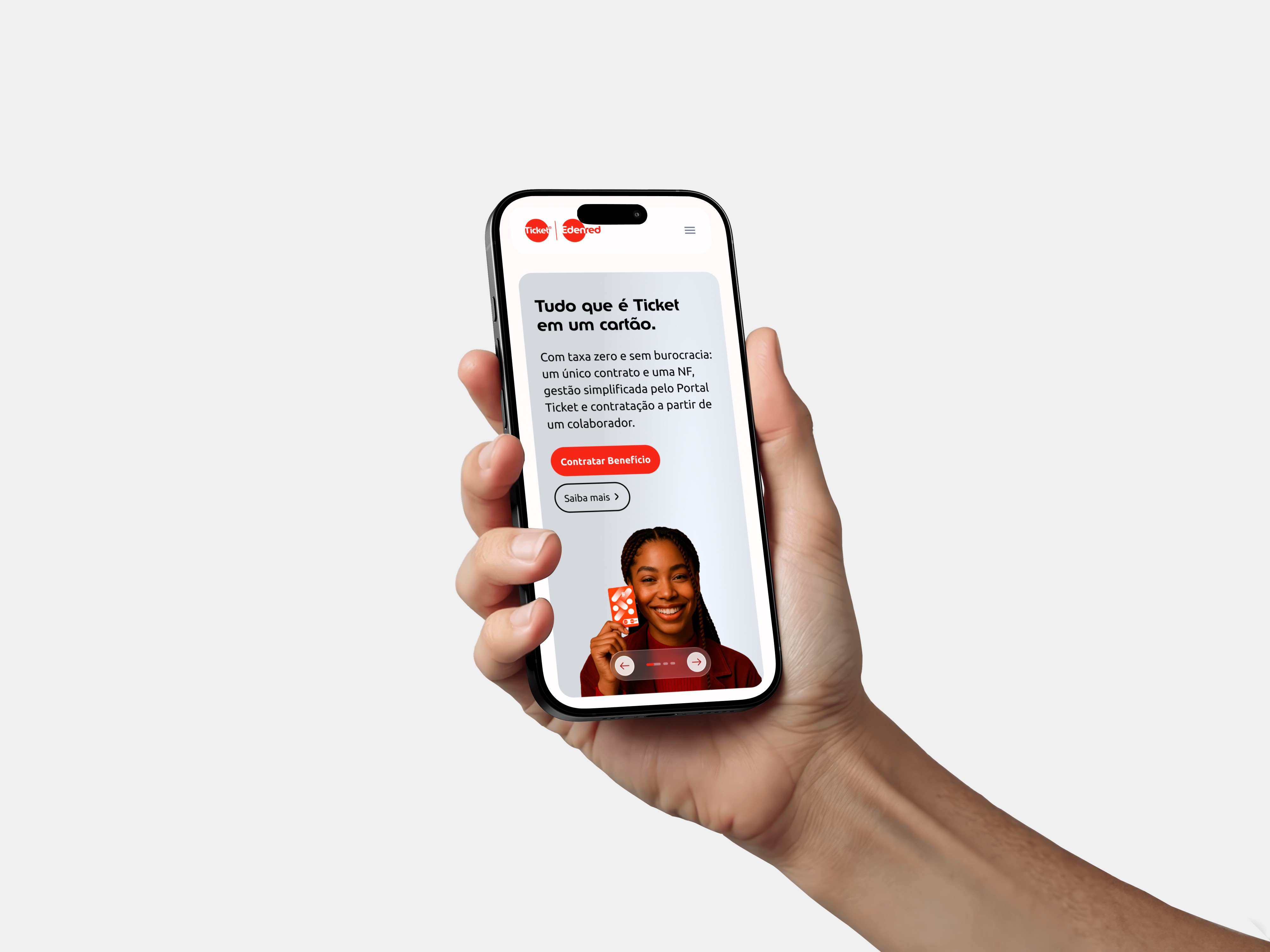
We redesigned the site’s structure around user groups and their goals, creating distinct journeys for businesses and HR teams, benefit users, and participating merchants. We prioritized B2B conversion, quick access to common tasks, and simpler operational workflows.

Results
01
02
Content guidelines
Editorial guidelines with consistent terminology, a benefits-focused tone of voice, and a plain-language glossary to replace internal jargon and legal terms with clear, accessible language.
03
Page structure
Information architecture organized around user groups and their goals, with simpler navigation, shortcuts to frequent tasks, and fewer steps for the most common actions.
05
Exploring opportunities beyond existing products to create distinctive experiences and new ways to deliver customer value.